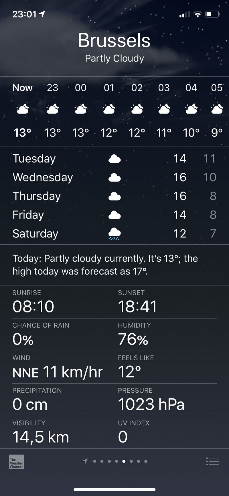
If your AQI (Air Quality Index) complication is only showing ‘–‘ instead of the real a value, then it’s probably because Apple does not have the AQI data for your selected city. See below the difference between a city that does have AQI data (Gold City) and another one that doesn’t (Brussels) – you can check it for yourself in the default iOS Weather app:
A few tips: 1. to change the default city on the Apple Watch, open the Watch app on your iPhone and go to My Watch / Weather / Default City. 2. if the default iOS Weather app does not provide AQI data for your city, there is still a chance that other apps – like Air Matters – will do. If that’s the case, you will need to install that app on your watch and use its complication to show the AQI on your watch face 3. if you are interested in the quality of your indoor air, get an air purifier and air quality monitor, like the AirVisual Pro.
An incident is an event that is not part of the standard operation of a service and that causes an interruption or a reduction of service. In simpler words, an incident is an unplanned interruption of service.
Contents of a post-incident report (The post-incident report alternative names: incident report, postmortem report)
Timeline: what exactly happened and at what times?
Metrics: how well did we react? (time to detect, time to react, time to close)
Procedures: were they adequate? were they being followed?
Root cause analysis: is the root cause understood?
Lessons learned: what corrective actions can we take?
Tip: If the incident caused financial loss, attach the current and potential security controls to the timeline. Which controls limited the loss, and which controls could be acquired in the future? Also, it’s a good idea to calculate potential losses if the existing controls would not have intervened. This will help establish the overall return of security investment (ROSI).
A postmortem is a written record of an incident, its impact, the actions taken to mitigate or resolve it, the root cause(s), and the follow-up actions to prevent the incident from recurring. When to create one? Interruption of service, data loss, monitoring failure, etc. 3 best practices: avoid blame, keep it constructive, collaborate and share.
For a postmortem to be truly blameless, it must focus on identifying the contributing causes of the incident without indicting any individual or team for bad or inappropriate behavior. A blamelessly written postmortem assumes that everyone involved in an incident had good intentions and did the right thing with the information they had.
When I come across charts like this, this or this, my reaction is to point to obvious: that the information is unreadable by 1 in 12 men and in 1 in 200 women. Being one of them certainly helps to see the problem 🙂 Pointing it out is certainly good for raising awareness, but it’s not enough. Driving change is what ultimately matters. And the good news is, in most cases the change is really easy. So easy that I can resume it to two action points:
1. Don’t use color alone to convey meaning. Use icons, written content, and other visual elements to reinforce clear communication of the content.
That’s it!Seriously. Add some symbols to your chart bars and pick a colorblind-friendly palette. Implementing the two points above will make your data visualization efforts more inclusive. If you want to go the extra mile and show some empathy, then
Test what it’s like to view your designs through a color blindness simulator