Form design patterns – my notes

Written on 7 March 2019, 11:31pm

Tagged with: ,

Here are some notes relevant to me after reading the Form Design Patterns:

  • The inclusive design principles are about putting the user first
  • (in the context of a registration form): Nobody wants to sign up to your service — they just want to access whatever it is you offer, or the promise of a faster experience next time they visit.
  • Related: Nobody wants to log in to your site. They’re forced to as a security measure.
  • God help you if that video auto plays and wakes up my kid: I will find you.8 things parenting taught me about accessibility
  • One thing per page. Enough said.
  • Interactive things have perceived affordances. Making a checkbox round is like labeling the Push side of a door PullCheckboxes are never round
  • Sometimes you need to work hard to make things simple for the users
  • The way you ask your users for dates depends on the type of date you’re asking for. No, this is not matrimonial advice, it’s about calendar dates:
    • dates from documents: keep the same format from the doc (credit card, ID date, etc)
    • memorable dates (like user birth date): let them type it
    • future date(s): use a date picker
  • Hicks Law: the time taken to make a decision increases as the number of choices expands.
  • Confirming vs undoing: “Are you sure you want to launch the nuclear missile?” vs “3 emails have been archived. Undo” It all depends on the context. Sometimes you want speed bumps on the road (request explicit confirmation), some other times you want to let users perform the action immediately, without any warning.
  • When you’re an online store, make sure your search function can search everything. Not only products, but also the return policy
  • Don’t employ infinite scroll by default (‘show more’ link instead) and don’t break the back button
  • AJAX is not necessarily faster (it will only render when 100% of the page is ready)
  • <input type=”file” capture=”user|environment”> only works on mobile devices and opens up the front or the rear camera.
  • When working with long forms it’s better to check before you start (to make sure you don’t waste your users time) or to break the long processes into smaller tasks and show completion progress (the task list pattern)
Sunny – rainbow – cloudy

Refactoring UI book – my notes

Written on 19 February 2019, 11:49am

Tagged with: ,

For some reason, I still prefer the paper version…

Here are some notes relevant to me after reading the Refactoring UI book:

  • border radius: large=playful, no radius=formal. Just be consistent, not like Dropbox
  • you can highlight an element by de-emphasizing the others
  • sometimes the labels are not needed… but some other times they are mandatory. Just use your common sense. Also, make sure there is no confusion about which label belongs to which value
  • differentiate between primary vs secondary (or tertiary) actions
  • stick to 45-75 characters per line if you want to play it safe
  • line height and font size are inversely proportional
  • if some paragraph is longer than 2-3 lines, it will look better left-aligned
  • always right-align numbers
  • don’t rely on color alone: use the contrast, or even better, add patterns
  • try to emulate a light source when working with non-flat interfaces
  • don’t scale up small icons, just re-draw them completely to add more details. Conversely, don’t scale down big icons, just re-draw them (ex. draw a separate logo and scale it down to obtain the favicon)
  • don’t simply copy/paste screenshots: either paste screenshot from phone/tablet mode, zoom-in to the relevant section, or use a generic UI
  • lists don’t necessarily mean bullet points: can be check-marks or locks
  • re-think drop-downs, tables and radio buttons

I was surprised by the amount of useful information I learned in what felt like a couple of hours read. This is more than a simple book that you close and put away after you’re done reading it; it’s something that you might come back to from time to time for inspiration when you work on your next design project.

Notes made with workflowy

A few notes on accessibility

Written on 8 May 2018, 02:10pm

Tagged with: , ,

1. Accessibility is not only about screen readers and keyboard users. It’s about a system being accessible by anyone, from everywhere:
– if it’s too slow, it won’t load on poor connections
– if it only works in certain configurations (i.e. browsers), it won’t be accessible to everybody
– if the content it’s poorly written, too complex or difficult to be read then it’s not accessible

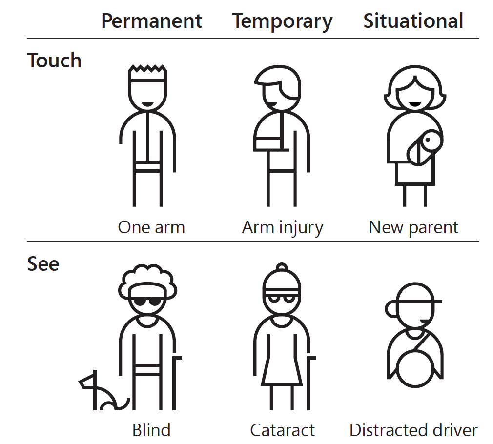
2. The impairment can be temporary (broken arm, eye surgery, etc) or situational (driving, party, theater). In my experience, I also found users that didn’t even know they had an impairment: they had a form of color vision deficiency (just like I do 🙂 ).

3. There is no drawback if you design with accessibility in mind (designing for the extremes). The non-disabled users will also benefit from this approach.

4. Add accessibility as a requirement early in the design. Think inclusive!

5. Challenge your team to use the system:
– using a screen reader
– without their hands
– on a browser without JavaScript
– from a poor connection (ex. Chrome Dev Tools can simulate this)

Resources:
Manuel Matuzović: My Accessibility Journey: What I’ve Learned So Far
W3C: Diversity of Web Users – How People with Disabilities Use the Web
Inclusive: A Microsoft design toolkit


Image source: https://medium.com/valtech-design/inclusive-design-dd4e03f82094