2 notes on data visualization

Written on 9 October 2019, 09:37pm

Tagged with: , ,

  1. Know the limitations of pie charts: not so good for comparing values between themselves, but really good to compare relative to the 50% line
  2. Match your type of data with the right color scheme. There are 3 types of data: sequential, divergent and qualitative. The sequential color schemes help with ordered data. The divergent schemes use a neutral color the mid-range data and highly contrasting colors for the extremes. The qualitative schemes focus on creating visual differences between the sets of data.
Bar charts are better if you need to compare the values
But pie charts have their strengths when comparing to the 50% line
A sequential scheme. Colors range from light to dark, and are usually colorblind safe
A diverging scheme. Mid-range neutral color, highly contrasting extremes.
A qualitative, colorblind-safe scheme. It gets trickier if you need more than 4 colors. Each color need to scream “I’m different!

https://www.data-to-viz.com/caveat/pie.html
https://www.perceptualedge.com/articles/visual_business_intelligence/save_the_pies_for_dessert.pdf

http://colorbrewer2.org

When I come across charts like this, this or this, my reaction is to point to obvious: that the information is unreadable by 1 in 12 men and in 1 in 200 women. Being one of them certainly helps to see the problem 🙂
Pointing it out is certainly good for raising awareness, but it’s not enough. Driving change is what ultimately matters. And the good news is, in most cases the change is really easy. So easy that I can resume it to two action points:

1. Don’t use color alone to convey meaning. Use icons, written content, and other visual elements to reinforce clear communication of the content.

https://accessibility.digital.gov/visual-design/color-and-contrast/


2. Make sure there’s sufficient contrast between graph colors so people with color blindness can distinguish the colors.

https://accessibility.digital.gov/visual-design/data-visualizations/

That’s it! Seriously. Add some symbols to your chart bars and pick a colorblind-friendly palette. Implementing the two points above will make your data visualization efforts more inclusive. If you want to go the extra mile and show some empathy, then

Test what it’s like to view your designs through a color blindness simulator

https://accessibility.digital.gov/visual-design/color-and-contrast/
https://uxdesign.cc/designing-for-accessibility-is-not-that-hard-c04cc4779d94

The take away here is that “Designing for accessibility is not that hard“. As in the case of football, “This is not rocket science. It’s really about easy fixes“:

A few notes on accessibility

Written on 8 May 2018, 02:10pm

Tagged with: , ,

1. Accessibility is not only about screen readers and keyboard users. It’s about a system being accessible by anyone, from everywhere:
– if it’s too slow, it won’t load on poor connections
– if it only works in certain configurations (i.e. browsers), it won’t be accessible to everybody
– if the content it’s poorly written, too complex or difficult to be read then it’s not accessible

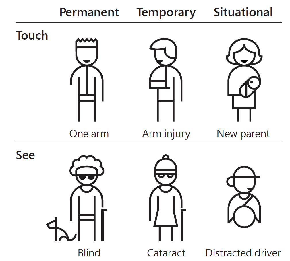
2. The impairment can be temporary (broken arm, eye surgery, etc) or situational (driving, party, theater). In my experience, I also found users that didn’t even know they had an impairment: they had a form of color vision deficiency (just like I do 🙂 ).

3. There is no drawback if you design with accessibility in mind (designing for the extremes). The non-disabled users will also benefit from this approach.

4. Add accessibility as a requirement early in the design. Think inclusive!

5. Challenge your team to use the system:
– using a screen reader
– without their hands
– on a browser without JavaScript
– from a poor connection (ex. Chrome Dev Tools can simulate this)

Resources:
Manuel Matuzović: My Accessibility Journey: What I’ve Learned So Far
W3C: Diversity of Web Users – How People with Disabilities Use the Web
Inclusive: A Microsoft design toolkit


Image source: https://medium.com/valtech-design/inclusive-design-dd4e03f82094