10 things that I liked in 2018
Written on 31 December 2018, 12:50pm
Tagged with: books, learning, movies, photo, productivity, recommendations, security, Tesla, yearly_roundup
In the last day of the year, it’s time to look back at the year and highlight the things that enjoyed in 2018. For reference, here is the list from the last year.
1. Two books: Daemon and Freedom, by Daniel Suarez. Absolutely brilliant, I don’t know how I missed them for so many years. Here’s an excerpt:
The Code book from Simon Singh was probably the runner-up – a few months ago I ordered the printed version and read it again after 5 years.
2. My new notebook: Huawei Matebook x Pro. Say what you want about Huawei, but they came up with a brilliant device. Miles ahead of the premium-priced Macbooks, it fundamentally changed my workflow. Never been a tablet guy and probably never be, so the combination of an iPhone + an ultrabook like the Matebook works best for me.

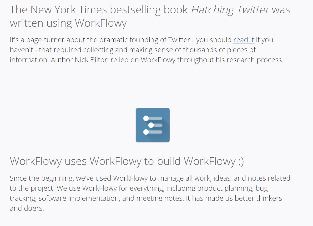
3. WorkFlowy: an exponent of the makers (*) culture, WorkFlowy is a dead-simple, cross-platform note-taking app. The hierarchical structure of the notes makes it compatible with mind-mapping and I found myself using it in a variety of ways. For instance, I drafted the outline of this post in WorkFlowy. Others wrote books with it:
(*) the makers culture: Peter Levels https://levels.io/ https://makebook.io/
https://twitter.com/ajlkn https://carrd.co/
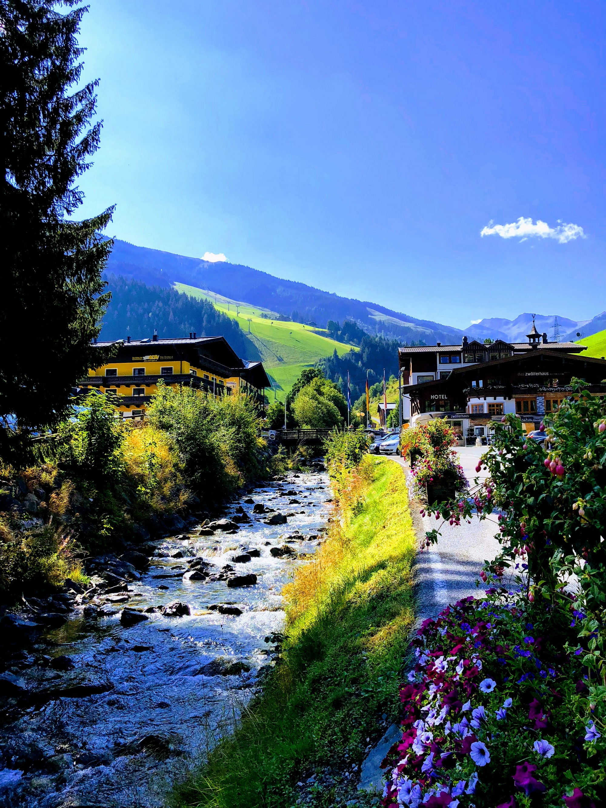
4. A place: the Austrian Alps in the summer time. I had the chance to spend about a week in the mountains. The combination of mountains, clean air, outdoor activities and clear blue sky is amazing. Just have a look:
5. Security. There were plenty of security things that I learned in 2018. Went to a few classroom training sessions (CISM, CISSP, TLS), passed some challenging certification exams, and realized that (IT) security is a fascinating domain with a lot of brilliant people.
The IT industry rocks (as one of the security guys that I follow said today), and on top of that, the security aspects make things much more interesting to watch.
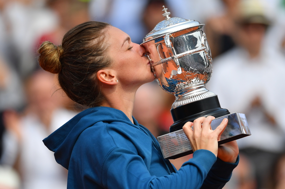
6. Simona Halep: not only for finally winning her Grand Slam, but also for having the capacity to remain competitive for a long time: never dropped out of the top 10 for over 5 years and currently number 1 for more than a year (with a brief 4-weeks interruption). Well deserved and very inspirational.
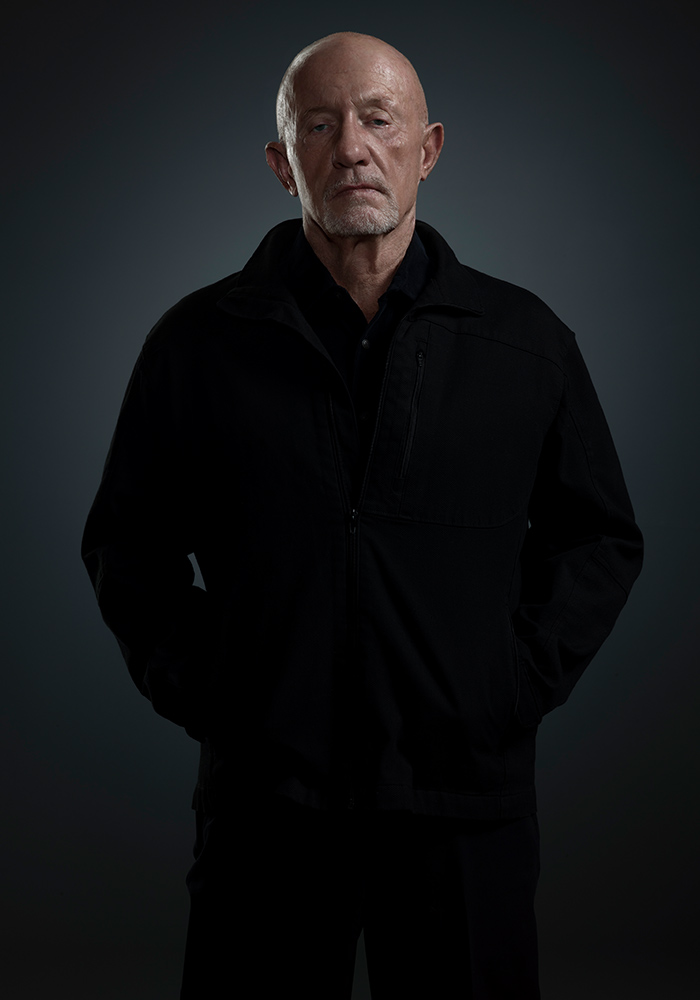
7. Two series: Breaking Bad and Better Call Saul. I enjoyed watching Breaking Bad when it was released on Netflix, and found the Better Call Saul a very good continuation of the series. Now that Better Call Saul is over, I went back to re-watch Breaking Bad – it’s amazing how a few years and another prequel change the perspective.
8. Jurgen Klopp. He joined Liverpool 3 years ago and built an amazing team around him. One can learn a lot about leadership just by listening to his interviews. Humble and determined, he’s a perfect fit for Liverpool and you can sense how everybody around the club loves him.

9. The iPhone X – because the dimensions are finally right, and, more importantly, because its camera allowed me to take some amazing photos throughout the year: https://www.flickr.com/photos/dorin_moise

10. Tesla Model S. Finally, I left this at the end because it offered me some very mixed feelings. As I said in a recent post, the car is really amazing and it offers an experience that you will not find anywhere else. But the quality of the support services is disappointing here in Belgium. I hope that things will improve, even though I’m not holding my breath.
Here’s for a brilliant 2019 and remember, in the end it’s all about getting better.
